Thursday 25 August 2011
Sunday 21 August 2011


Sunday 14 August 2011
Poster Design

Possible layout
J. Mayer H.

I think what is most interesting about this poster layout is the use of 3rd dimension, with the use of vectors and scaling to make the sculptures stand out. There is a clear grid used as indicated by the position of the title, splitting the page in 2 horizontally. The position of the over-laid graphic implies the page is split up into 3rds vertically, which creates a nice balance of the graphic against the title. The use of a simple palette, with a washed-out background leaves a simple and sophisticated impression on viewers, steering clear of clutter or confusion. The font used is a simple sans-serif font, creating a sophisticated and modern look, with the use of colour and size appropriate hierarchy for the text. The background image continues into the corners which gives a professional, modern look.
Design Process
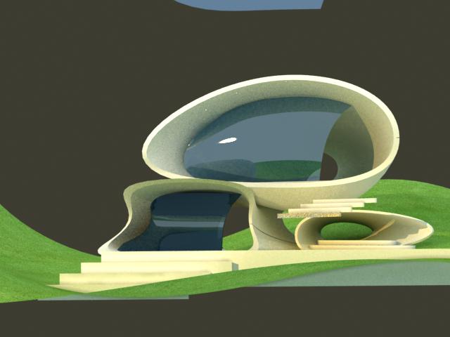
Throughout my design process I’ve been heavily influenced by the stylistic and sculptural designs of my chosen architect, Jurgen Mayer-Hermann. I’ve been intrigued by the playfulness in his work and have tried to represent this in my designs.
I’ve adopted the concept of exaggerated design, with reference to the main office of J. Mayer H. - I love the way this building commands attention, created by the numerous, circular, eye like openings in the facade which appear to ‘watch’ the street. Using my initial paper model I have continued this concept in a smaller scale building by exaggerating perspectives and using depth to achieve the same effect.
I have also played with the idea of perspectives in the creation of my client. My spore creature, “Insight” is all about the visual (and being a bit playful), her incredible vision is able to take full advantage of the extended perspectives of her environment.
Though there is still a way to go with my different marker, models and overall detailing, I feel I have a solid concept and direction in which my design is rooted.


Sunday 7 August 2011


Subscribe to:
Posts (Atom)